In a category defined by formality and distrust, Monzo rebranded banking as human, honest, and refreshingly pink.
The Boldest Brand Positioning Is Often in the Reversal
Most financial institutions try to look secure, powerful, and traditional. Monzo did the opposite.
While legacy banks leaned into navy blue logos, impersonal branches, and jargon-filled contracts, Monzo built a brand around clarity, community, and cultural disruption. It didn’t just offer an app, it offered an identity. One that felt modern, transparent, and even fun.
This post unpacks how Monzo used brand archetypes and cultural tension to position itself as the ‘anti-bank’ and how that gave it a loyal, growing user base in one of the most trust-fractured industries.
What Is a Brand Archetype?
Brand archetypes are universal characters that tap into the collective unconscious. They create emotional shorthand, making a brand instantly feel familiar, human, and trustworthy. There are 12 classic archetypes (e.g. The Hero, The Sage, The Rebel, The Creator). Monzo leaned into a hybrid: The Everyman meets The Innocent, with a dash of The Rebel.
This positioning said:
“We’re just like you. We speak like you. And we’re here to fix the system, not replicate it.”
Monzo wasn’t trying to be your banker. It was trying to be your money bestie.
Step One: Challenge Category Assumptions
Before positioning Monzo, its founders examined what banking looked and felt like:
- Cold
- Complicated
- Corporate
- Slow
- Distrusted
Instead of trying to be a “better” version of that, they flipped the script entirely. From tone of voice to product UX, every touchpoint communicated one thing: you’re in control now.
They didn’t just disrupt functionality. They disrupted feeling.
That emotional repositioning created a new kind of relationship, where trust wasn’t demanded through authority, but earned through transparency.
Language as a Branding Weapon
Monzo’s tone of voice is one of its strongest brand assets. It’s:
- Clear
- Playful
- Relatable
- Respectful
Where traditional banks might say:
“Your transaction could not be completed due to insufficient funds.”
Monzo says:
“Looks like you’re out of money.”
Simple. Human. Disarming.
This is brand positioning through language. It signals: “We don’t talk like a bank, because we’re not one.”
Words shape perception. And perception shapes loyalty.
Visual Identity: From Navy to Neon
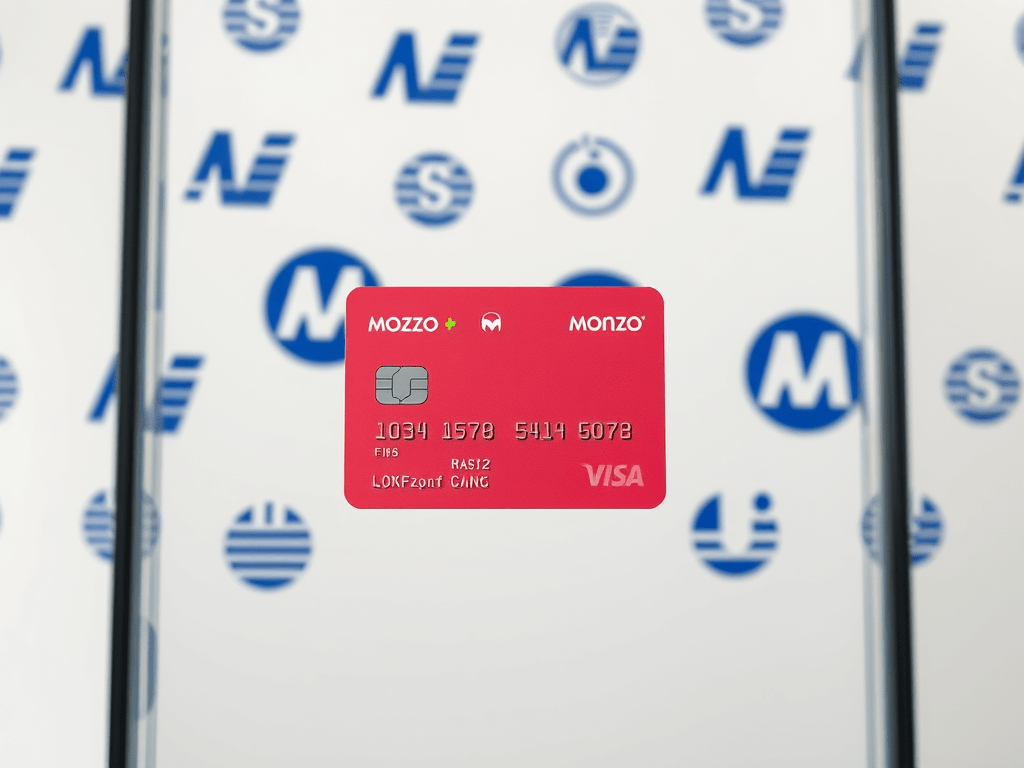
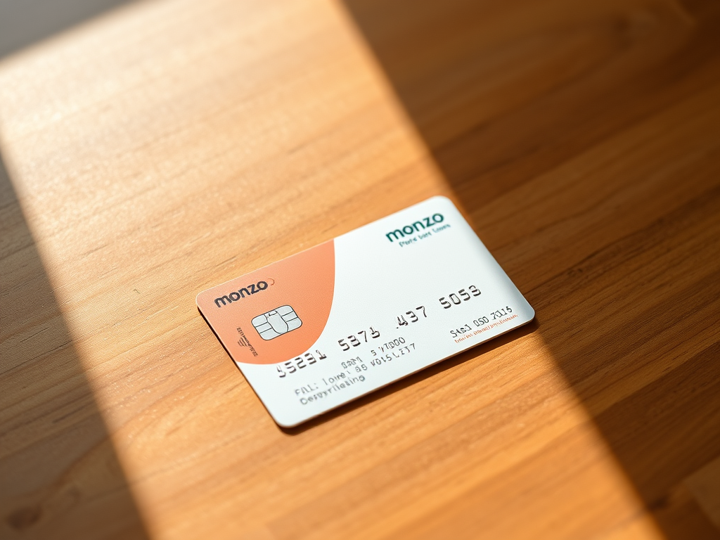
Let’s talk about the coral pink Monzo card. It wasn’t a design gimmick. It was a visual rebellion.
In a wallet full of greys, silvers, and blues, that flash of colour sparked curiosity and conversation. It told users: “You’re holding something different.”
It also made the brand inherently shareable. People posted their cards on Instagram. The card itself became a low-key status symbol especially among young professionals tired of being underserved by legacy banks.
This is how you turn a basic utility (a debit card) into a cultural asset.
Product Design: UX as Positioning
Monzo’s product experience was just as radical as its branding:
- Real-time push notifications
- Bill splitting with friends
- Budgeting tools built into the app
- Zero jargon, zero hidden fees
These weren’t just features. They were signals. Monzo was saying: “You deserve better. And here’s how.”
It made banking feel mobile-native, intuitive, and conversational, something no traditional bank was doing at the time.
Cultural Tension: Millennials, Money, and Mistrust
Monzo launched into a generation marked by:
- Financial instability
- Recession-era trauma
- Student debt
- Distrust in institutions
Its success wasn’t just a product of features. It was a response to cultural tension.
Millennials didn’t want better banks. They wanted different relationships with money. Monzo tapped into that sentiment, offering empowerment where other brands offered paperwork.
They didn’t try to be perfect. They tried to be honest. That choice resonated.
Community as Strategy
Monzo didn’t just serve a customer base, it nurtured a movement. Early users were invited to test, give feedback, and even invest through crowdfunding.
This built deep emotional ownership.
- Forums became active spaces of co-creation
- Product features were often developed from user requests
- Transparency about roadmaps and downtime built credibility
It wasn’t “us vs. them.” It was “let’s build this together.”
That sense of co-creation cemented Monzo’s brand as more than a fintech startup, it became a lifestyle choice.
How to Position Like Monzo
Even if you’re not in finance, the strategy behind Monzo’s positioning is applicable across categories:
1. Identify what your industry assumes and challenge it.
Look at tone, design, language, customer experience. Where’s the disconnect?
2. Choose your archetype and own it completely.
Be intentional about the emotional role your brand plays. Stick to it in every touchpoint.
3. Use cultural tension as a wedge.
What are people frustrated by? What unmet need or emotion can your brand satisfy?
4. Build trust through voice, not just features.
Products can be copied. Tone can’t.
5. Design your brand to feel like a friend, not a logo.
Especially in sensitive industries: finance, health, education, humanity is your edge.
Final Word: You Don’t Have to Be Loud to Be a Rebel
Monzo didn’t scream. It didn’t posture. It didn’t overpromise.
It simply chose to act differentlym consistently, clearly, and with people at the centre.
That’s what true brand positioning is: not a tagline, but a belief system. One that shows up in your product, your tone, your visuals, and your values.
If you want to stand out, don’t just talk differently.
Be different and make it obvious.


Leave a comment