
When familiarity breeds invisibility, here’s how to reset audience attention and engagement.
When Familiarity Becomes Forgettable
In branding, consistency is king, until it’s not. What was once recognisable becomes ignorable. Audiences stop noticing. Engagement drops. Creative feels stale. You’re showing up every day, but no one’s paying attention.
This isn’t failure. It’s science.
What you’re experiencing is brand habituation: a psychological phenomenon where repeated exposure to the same stimuli leads to decreased response. It’s the same reason we stop noticing a billboard after passing it every day or tune out an ad after hearing it too often. In marketing, habituation kills momentum. This post unpacks what causes it and how to disrupt it without losing brand identity.
What Is Brand Fatigue, Really?
Brand fatigue isn’t just about visual boredom. It’s a cognitive response.
When the brain identifies a pattern and deems it non-threatening or repetitive, it stops allocating attention to it. That’s how humans conserve energy. We notice what’s new, different, or emotionally charged. So if your content, campaigns, and messaging follow the same formula for too long, you risk becoming part of the digital wallpaper.
It’s not that your audience stopped caring. Their brains simply stopped recognising you as novel.
The Hidden Costs of Habituation
When habituation sets in, the brand suffers in more than one way.
• Engagement declines. Clicks, likes, saves, and shares decrease, not because your content is worse, but because it’s expected.
• Recall weakens. If your brand visuals or messages are overused, they blur into the background.
• Perceived innovation stalls. If nothing feels new, the brand can seem out of touch or irrelevant, even if the product is great.
• Emotional connection fades. Familiarity can lead to apathy, especially in crowded markets where attention is the currency.
Brand fatigue isn’t just an aesthetic issue. It’s a growth issue.
Case Study: Instagram’s Gradual Identity Shift
Instagram’s early brand identity leaned into skeuomorphism, camera icons, glossy textures, real-world references. But as the app evolved, so did its audience. To avoid stagnation, Instagram redesigned its logo and flattened its interface visuals.
This wasn’t just a design update. It was a strategic move to stay visually relevant in an era defined by flat design and clean interfaces.
The update sparked short-term backlash. But it ensured long-term memorability and relevance in a shifting visual culture.
Lesson: Refresh doesn’t always mean rebrand. It can be an evolution that keeps attention alive.

How to Stay Fresh Without Losing Brand Identity
Freshness isn’t about changing who you are. It’s about re-energising how you show up. Here’s how to do that without confusing your audience or diluting your brand equity.
- Refresh Core Visual Elements Without Abandoning Them
Start with micro shifts. Update your colour pairings. Introduce new textures or photo styles. Evolve your typography hierarchy. Maintain the foundations of your brand:logo, core colours, signature tone but explore ways to breathe new life into them across platforms.
Small changes signal movement. Movement signals growth.
- Break the Rhythm with Pattern Interrupts
If your audience expects a certain content structure, layout, or rhythm, break it.
If you always post polished carousels, try raw behind-the-scenes. If your voice is always formal, experiment with wit. These are what behavioural scientists call pattern interrupts, changes that reset attention by disrupting expectations.
Attention is a reflex. Interrupting patterns wakes it up.
- Layer Your Storytelling
If your visual language is static, start adding motion. If your captions are predictable, layer in narrative or micro-stories. If your feed is perfectly curated, let chaos in now and then. Brand fatigue often sets in when the brand becomes too rigid. Depth and dimensionality keep people curious.
You don’t need to reinvent yourself. You just need to reveal more sides.
- Introduce Limited-Time Visual Themes or Series
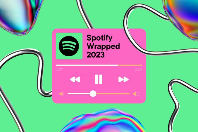
Build scarcity into your brand calendar. Limited visual series or content campaigns give your audience something new to engage with while still anchored in your core identity. Think Spotify Wrapped. Think Google Doodles. Think Fenty Skin’s campaign-specific assets.
The idea isn’t to change what you say. It’s to change how you say it, when, and for how long.
Relevance Is a Practice, Not a Position
Brands don’t stay relevant by being consistent. They stay relevant by evolving in a consistent direction. The key is managing the tension between recognition and novelty. Your brand should feel like a friend who’s growing, not a stranger or a broken record.
Innovation doesn’t require abandonment. It requires attention; to your audience, your context, and your own creative restlessness.
Final Word: Don’t Fight Fatigue, Design Against It
The brands that stand out aren’t just louder or better funded. They’re more agile, more self-aware, and more committed to creative freshness. In a world addicted to the new, your job isn’t just to be seen. It’s to be re-seen.
So evolve often. Interrupt wisely. Keep moving.
Your brand can’t afford to be predictable.


Leave a comment